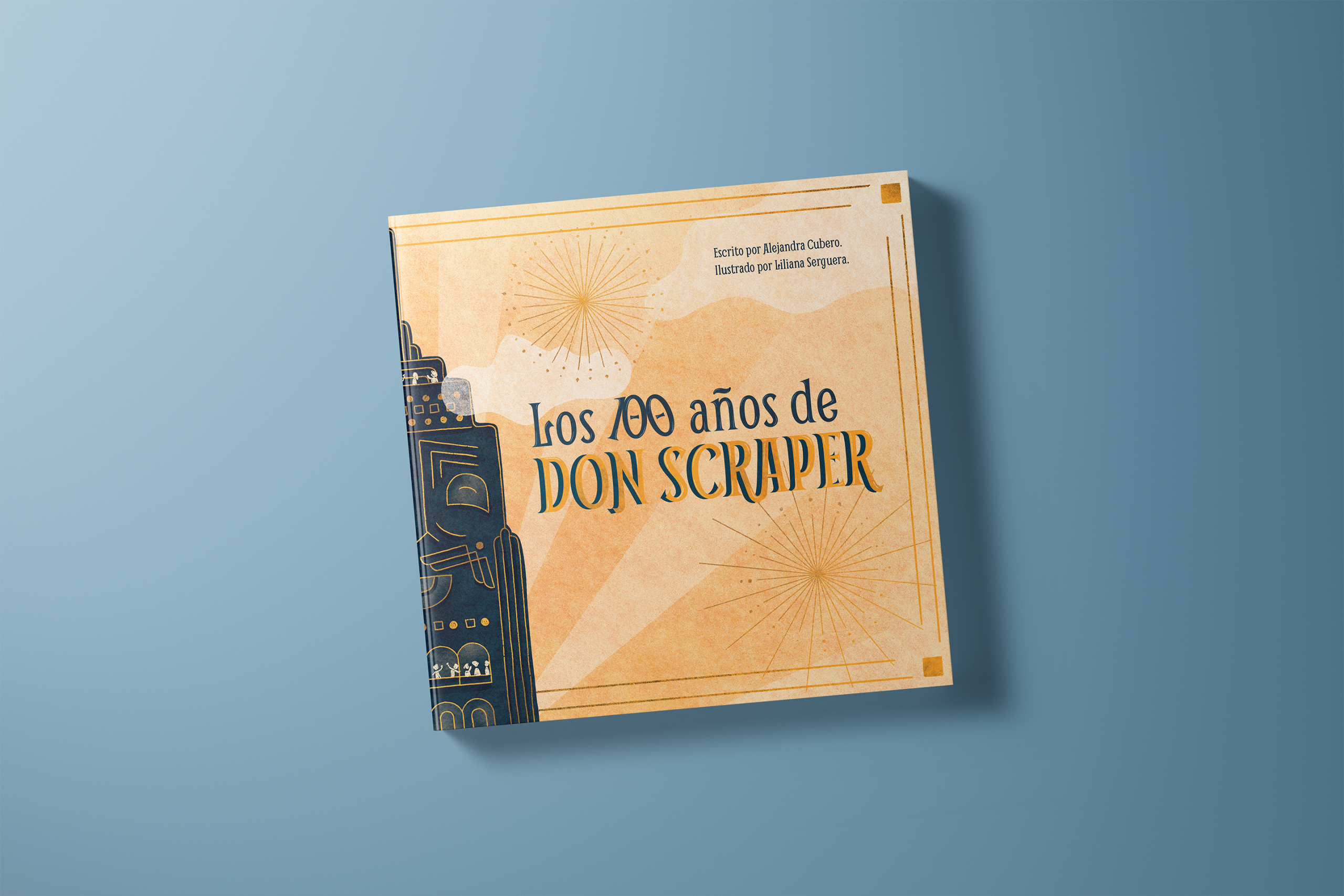
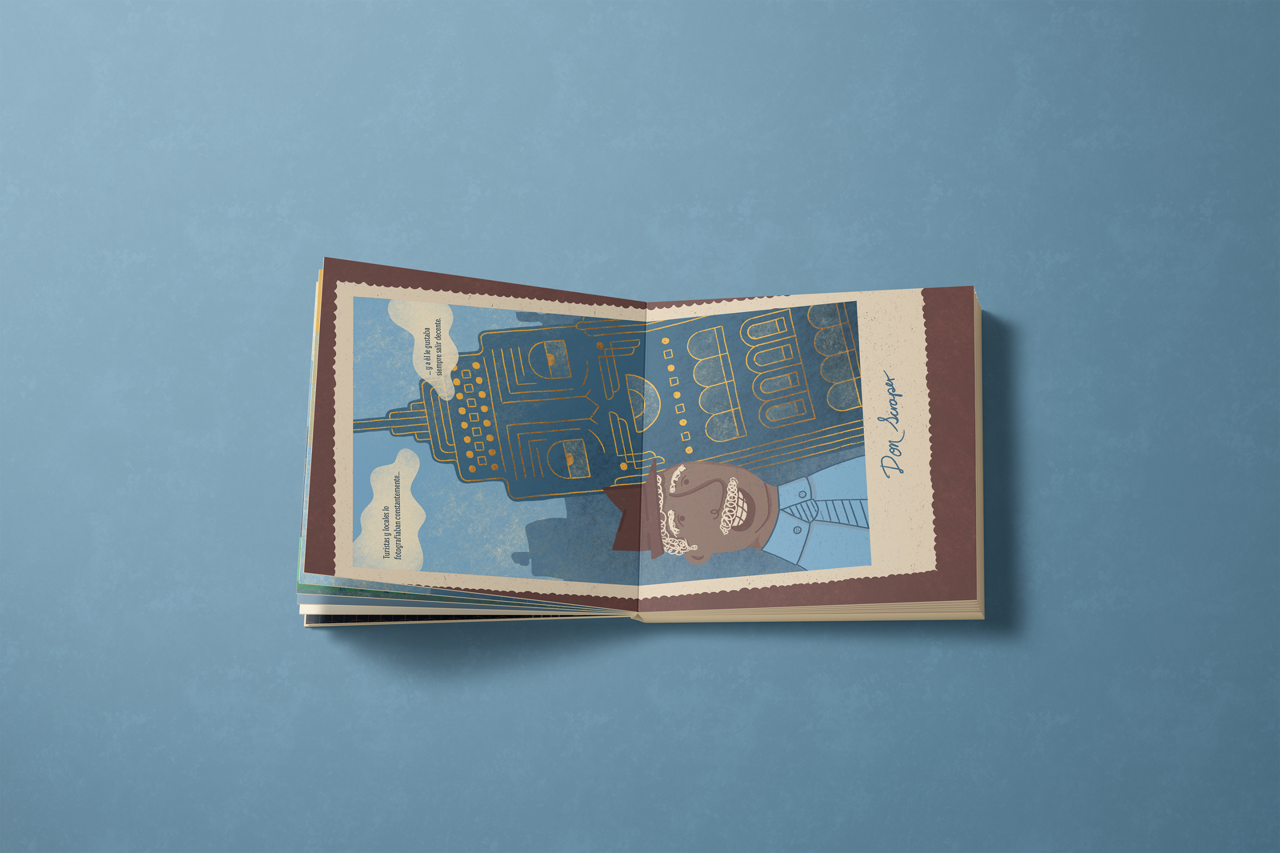
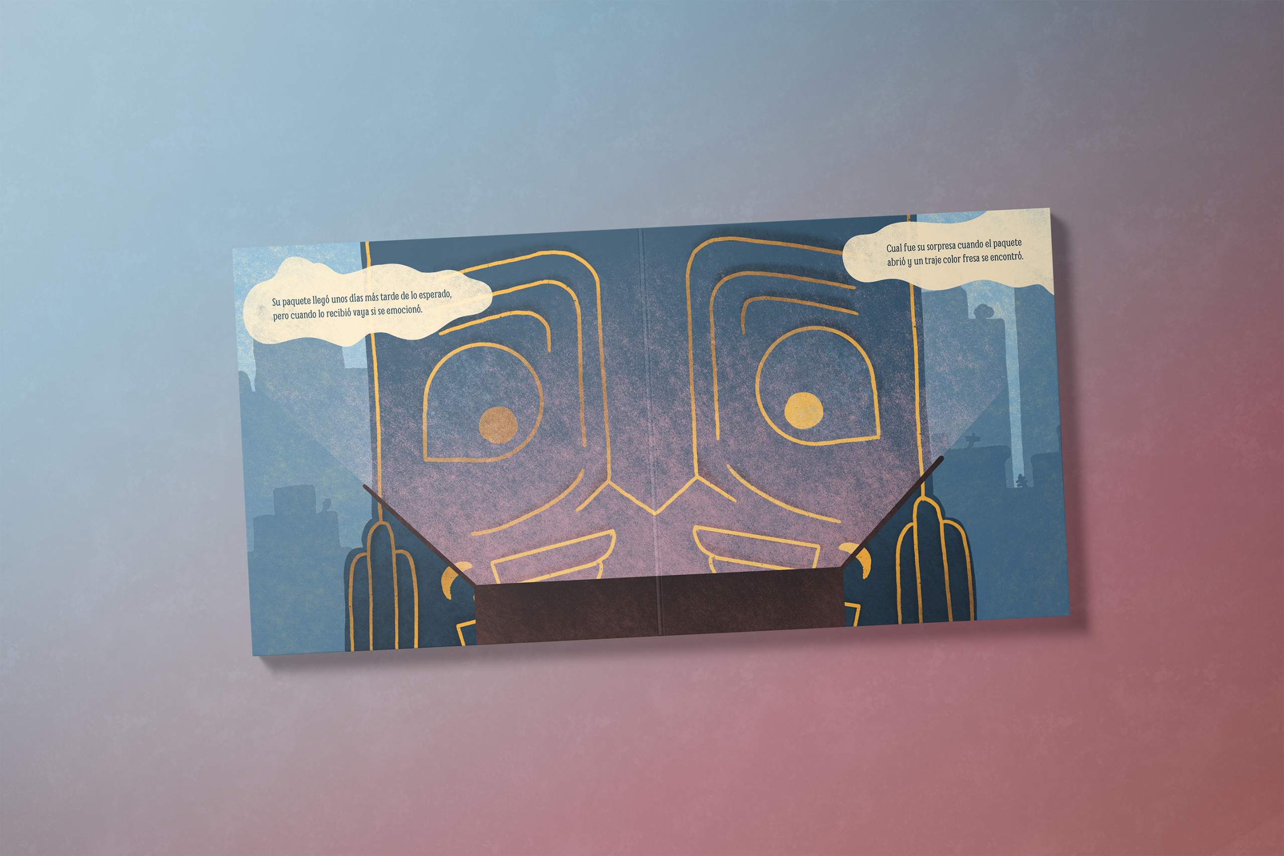
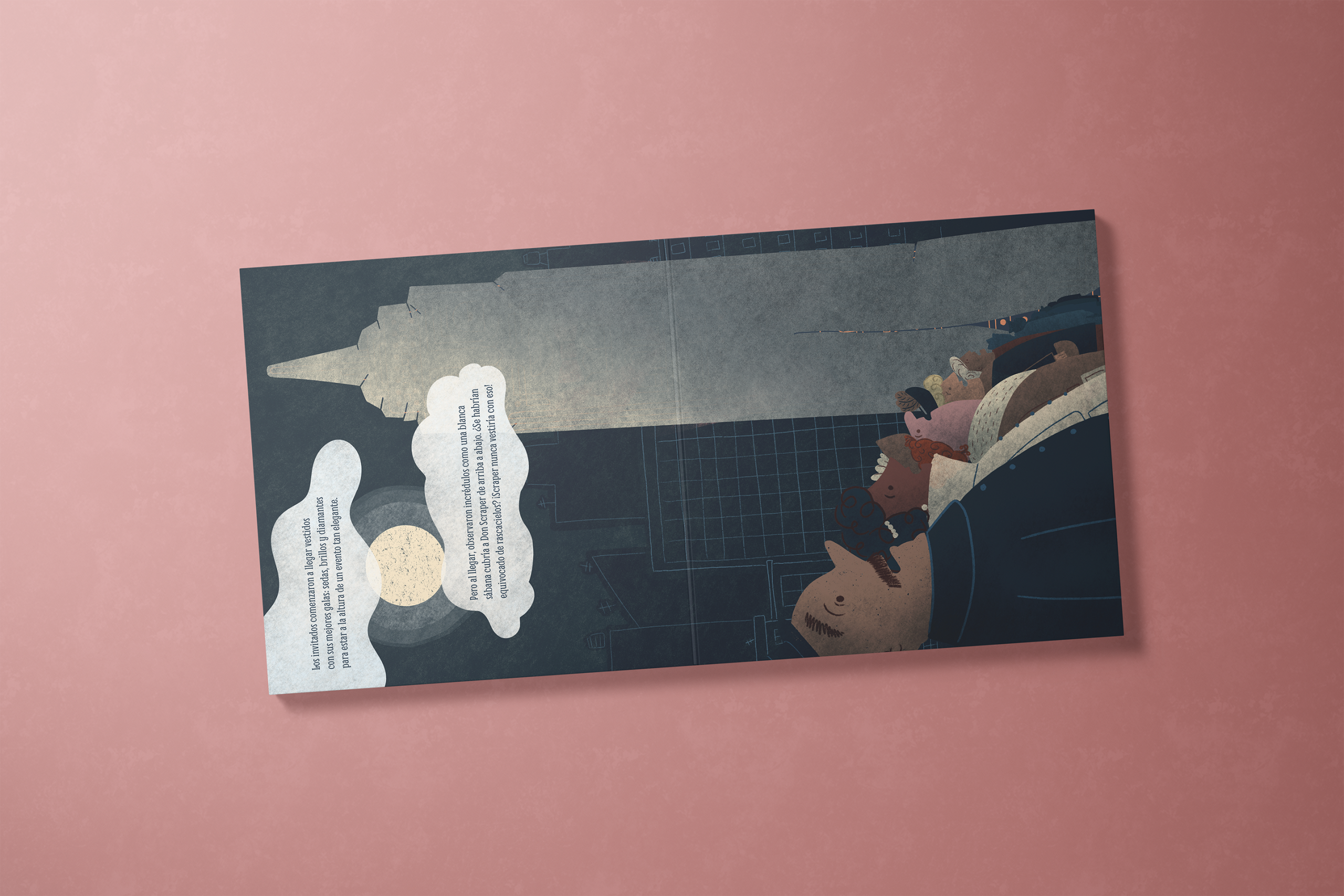
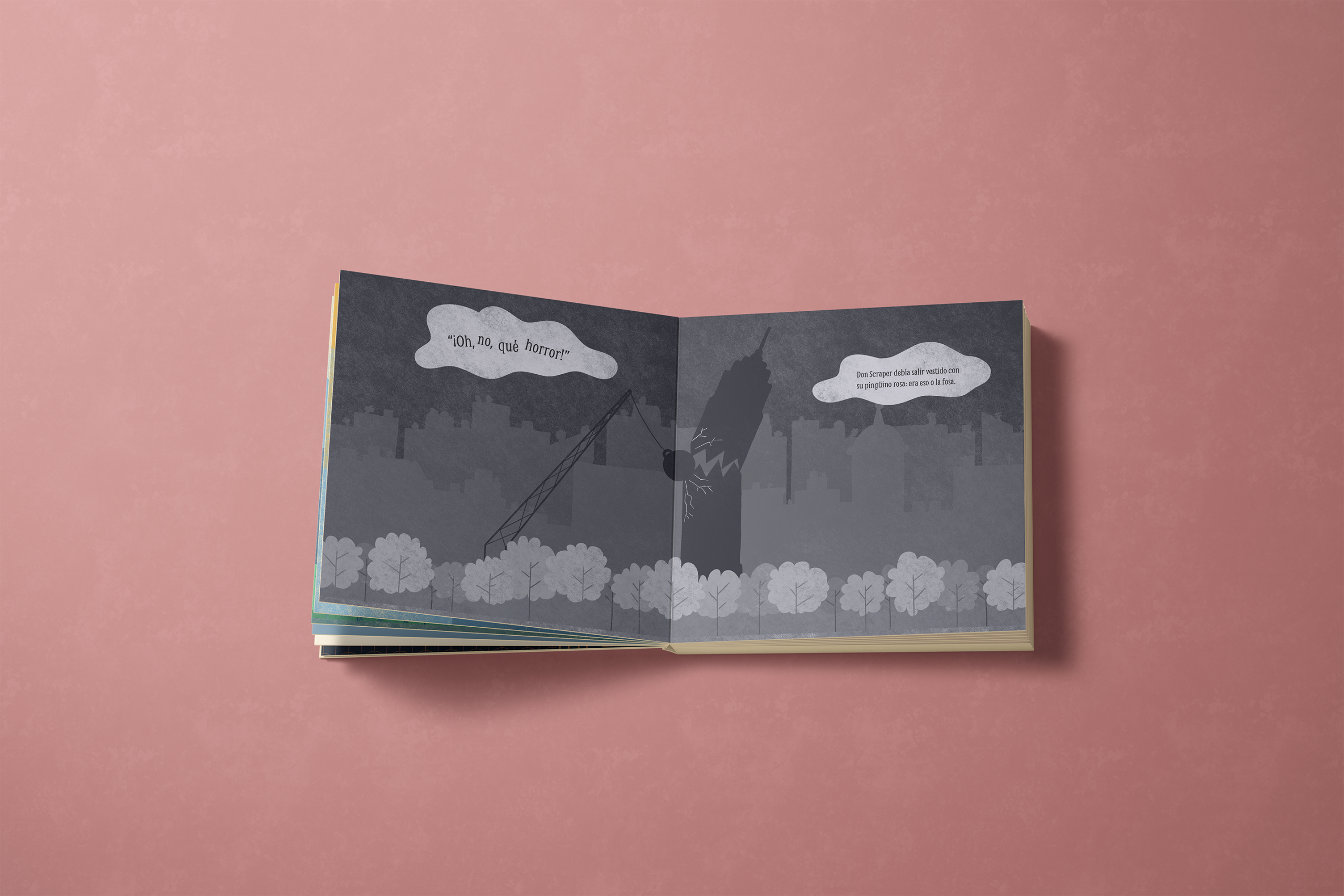
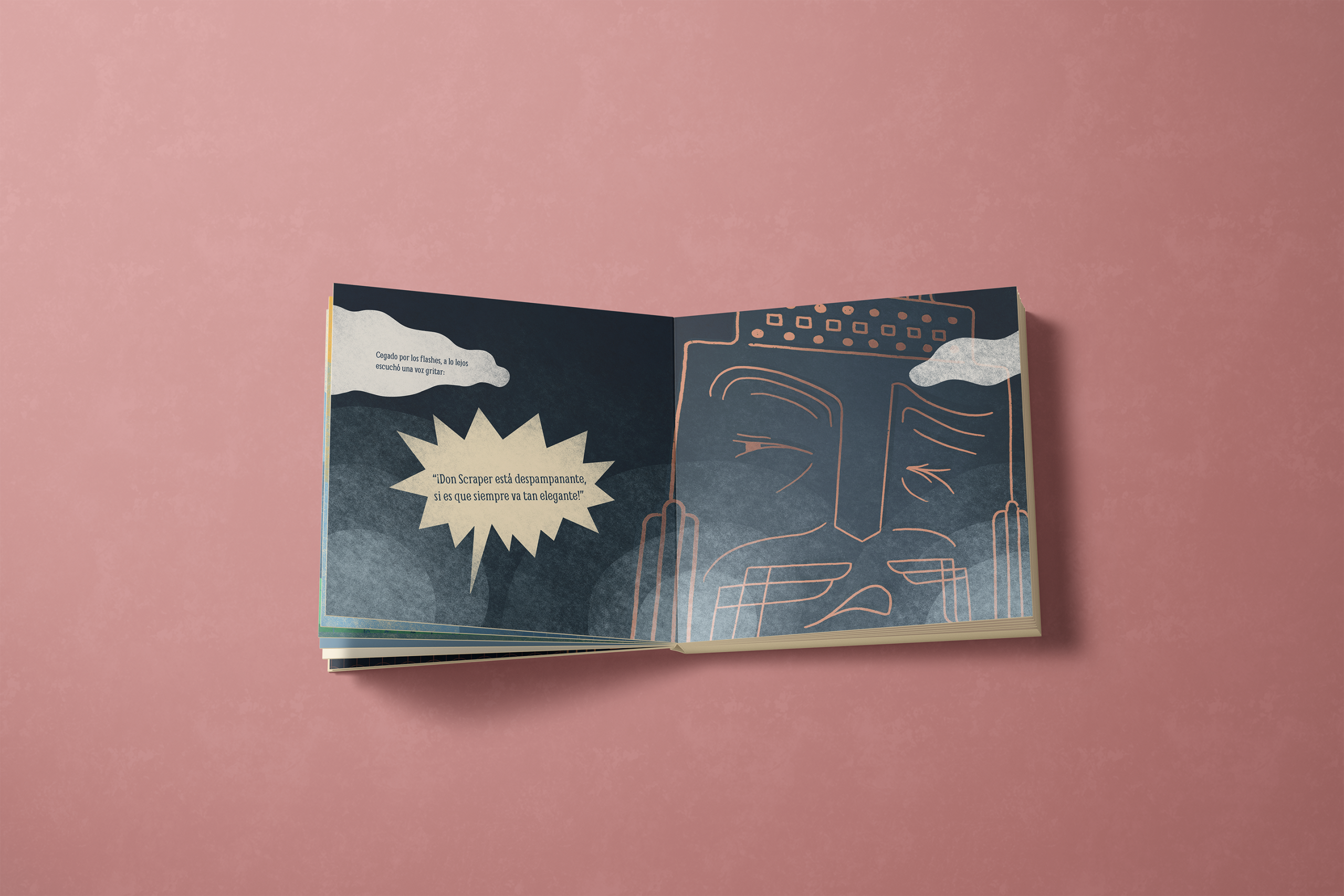
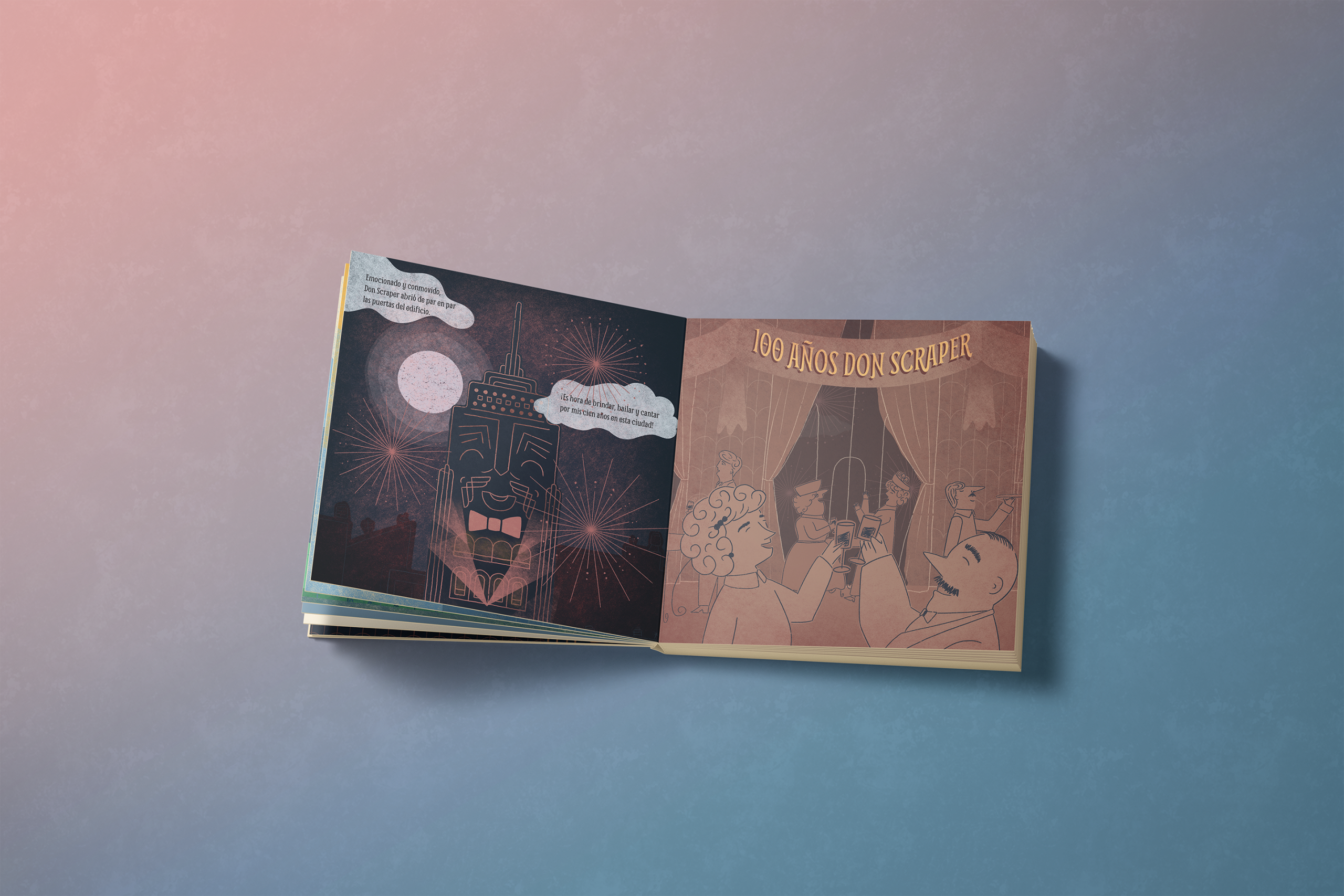
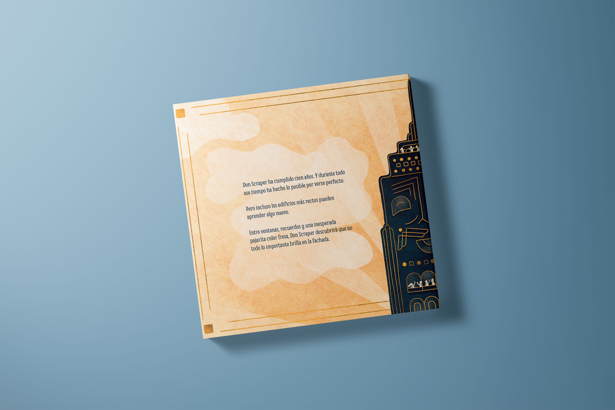
This was a very special challenge for me, my first time illustrating a children’s book, and a story whose message and character’s fears felt very close to home.
The opportunity that found me
Why I said yes
A friend of a friend proposed this collaboration to me. She shared her story, «Los 100 años de Don Scraper», and after meeting Don Scraper I knew I wanted create this visual world, so I started making a plan for the project.
The job was to design an illustration style that could hold that story’s very specific tone (funny and light on the surface, but carrying real weight underneath) and then develop that style across every spread in the book.
I had experience with illustration, but this was my first illustrated children’s book, so the biggest challenge was how I organized and approached the whole project.
There was something else at play, too… I recognized a lot of Don Scraper’s insecurities in myself, and that made it easier to understand not just what he does in the story, but why and how he feels. This is the kind of project I’m drawn to: stories with social impact, that are relatable and can really help people, where getting a character’s inner experience right isn’t a nice-to-have, it’s what people will connect to.
Self-image, self-worth, and identity are things I’ve struggled with my whole life, so shaping this character and his very relatable issues was an important challenge.
Understanding the story
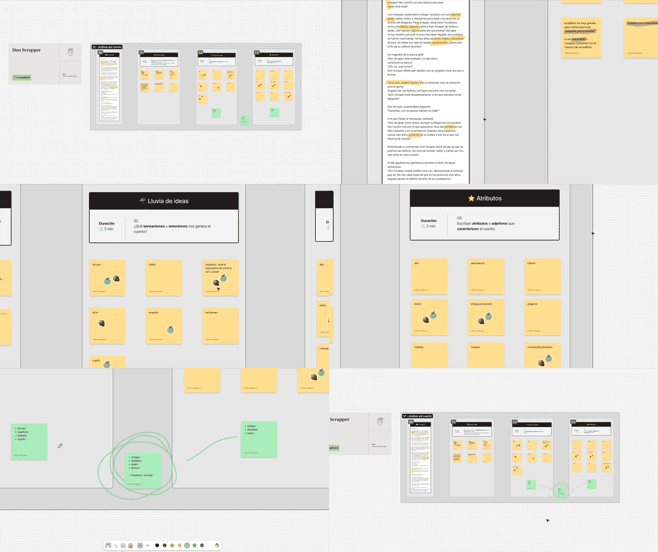
I started by decoding the story on my own: what’s the tone, who are the characters, what’s the message, what does the protagonist need to feel like on the page.
My analysis
Shared analysis
Then I ran the same exercise with the author. She’s the one who knows Don Scraper, his history, his insecurities, why he does what he does, so her read on the story wasn’t a check-in, it was part of the analysis itself.
That gave us a shared brief before a single line was drawn:
Tone → light, optimistic, full of humor
Themes → self-acceptance, part of a community, and intrinsic value
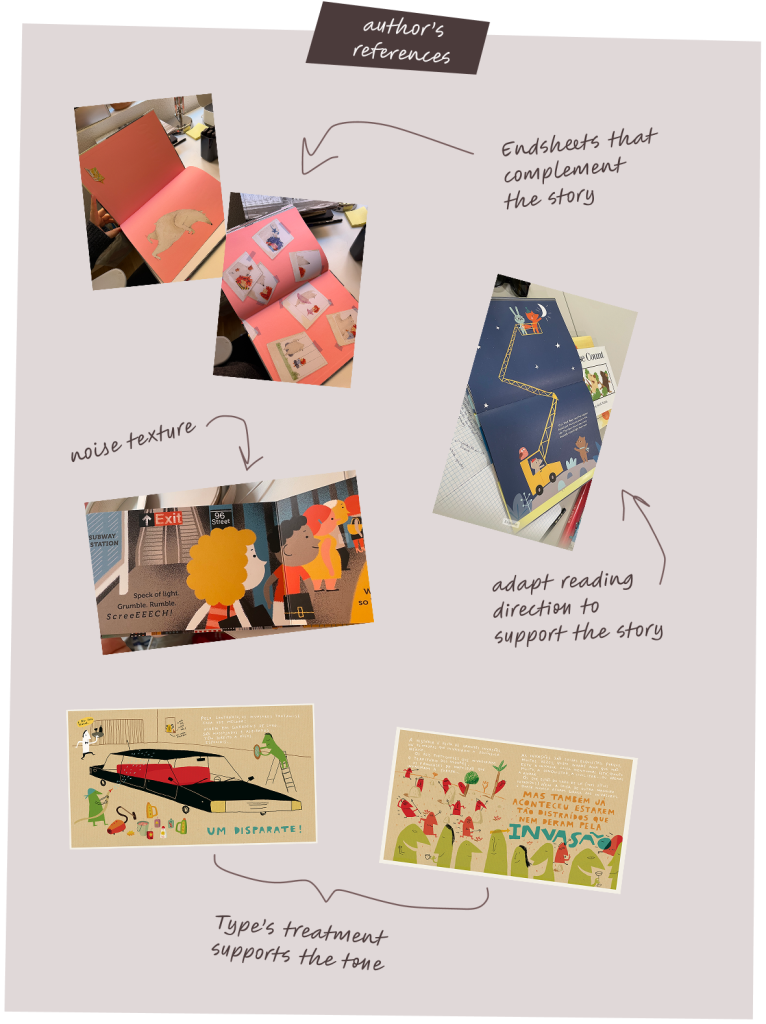
With the story analysis done, I asked the author to share references of her own. Things she liked, or thought made sense for the book. I set up a space in the file for her to drop in pictures, note what she liked about each, and explain how she saw it fitting our project.
Author’s half of the moodboard
The author is a lover of children’s books herself, which meant she came in with plenty of references already in mind. For that I created a space on the figma file and asked her to include the references she liked and thought made sense for our project, including notes of what she liked about each, and explain how she saw it fitting our project.
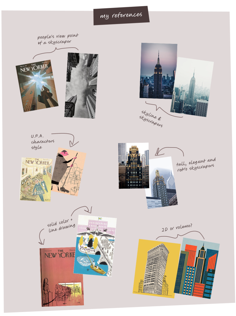
My half of the moodboard
With the brief in mind, I started collecting references of art deco buildings, skylines, how people interact with skyscrapers, graphic techniques, and retro illustration styles for people and buildings.
I pictured Don Scraper’s world as something between The Aristocats and the mid-century UPA cartoon style.
Then, with the author’s references and mine together, I distilled a set of insights, which became two full style proposals for the author to choose from.
Two ways to dress a skyscraper
Style A – Warm Sketch
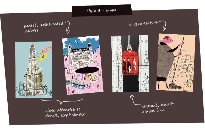
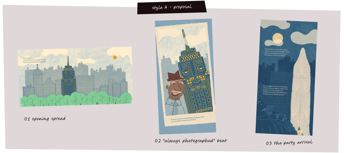
Rooted in Don Scraper’s own insecurity and age, Style A leaned into loose, hand-drawn linework and a softened, nostalgic palette. Contained silhouettes, exaggerated and humorous proportions, and quiet, minimal backgrounds prioritized warmth and closeness over precision.
A – Characteristics
manual, hand-drawn line
visible hand-technique texture
pastel, desaturated palette
close attention to detail, kept simple
landscape double-page format
Style B – Sharp Suit
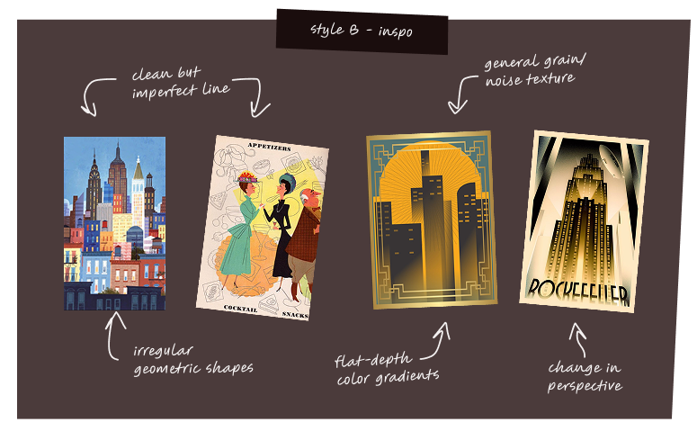
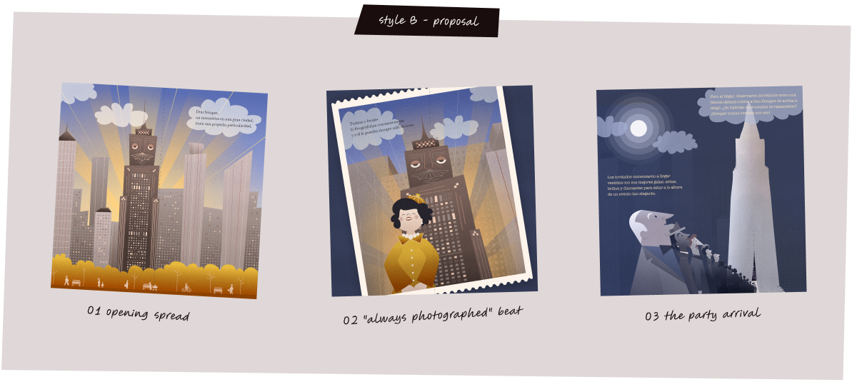
On the other hand, style B leaned into the old-world elegance Don Scraper wears so well — geometric lines, structured shapes, and precise ornamentation borrowed from art deco. To keep it feeling like a children’s book rather than a design museum, I layered in grain and imperfect noise as a hint of the fragility under his polished façade, with a bolder, slightly desaturated palette and flat-depth gradients.
B – Characteristics
clean but imperfect line
irregular geometric shapes
flat-depth color gradients
bold, slightly desaturated palette
general grain/noise texture
square double-page format
Style A - proposal
Style B - proposal
The verdict
Once I had both proposals, I sent them to the author so she’d have time to sit with them before we got on a call. We talked it through live, right on the shared Figma file, where she could leave comments directly on the work, no separate deck, no scattered emails, one place where every round of feedback stayed on record for both of us.
She loved both, and said the decision was harder than she expected, but going with her gut, she circled Style A. It’s warmth matched the story’s heart, and its willingness to be a little imperfect made Don Scraper relatable from page one.
Creating this universe
Finding the rhythm
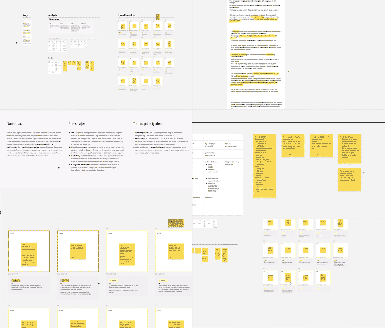
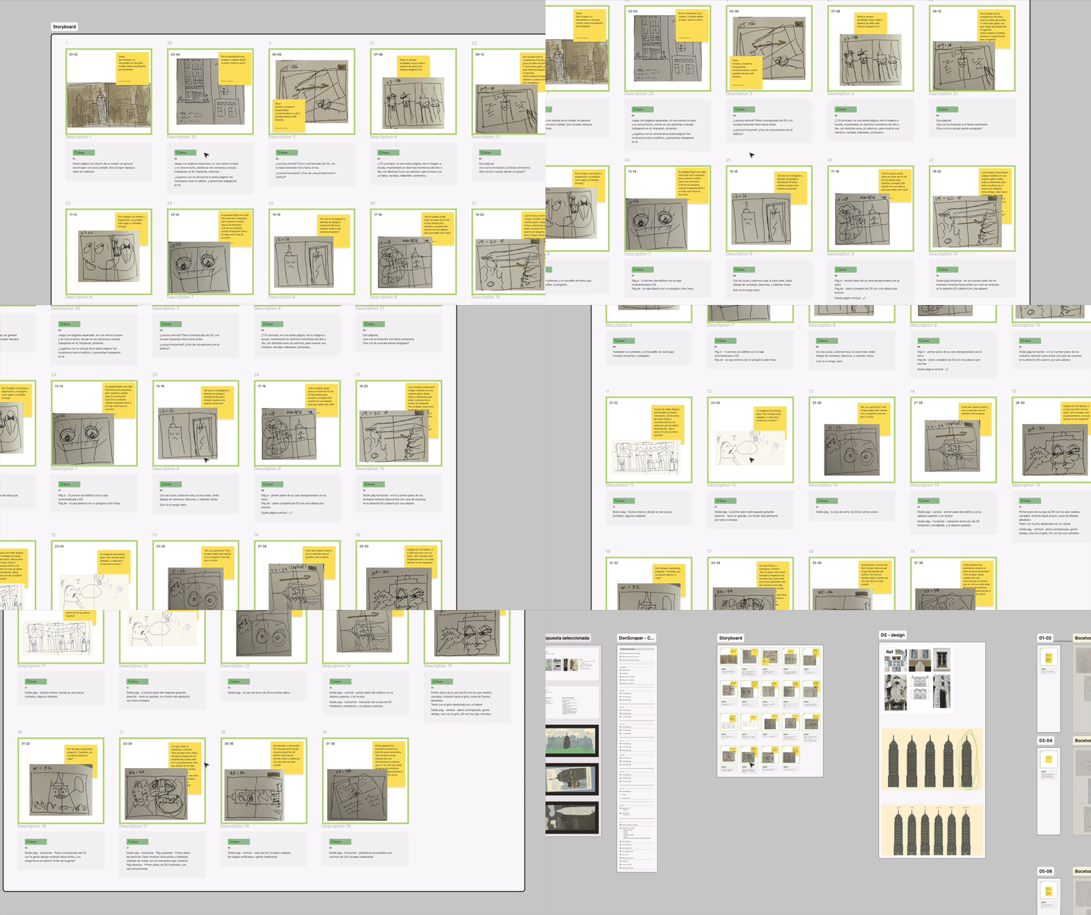
Spread sheet + storyboard exploration
Developing Style A across the full book turned into its own process of trial and error — which is exactly what building a brand-new visual language from a two-page proposal looks like in practice. The first illustrations were the hardest: they weren’t just drawings, they were where the style itself got tested and defined.
I started with a simple rhythm — one illustration a week, reviewed with the author every few weeks. Partway in, I could feel spreads starting to
repeat the same visual rhythm, so I built a full storyboard — starting from the scene breakdown I’d made for the budget — and used it to plan where the story needed a different point of view to stay dynamic.
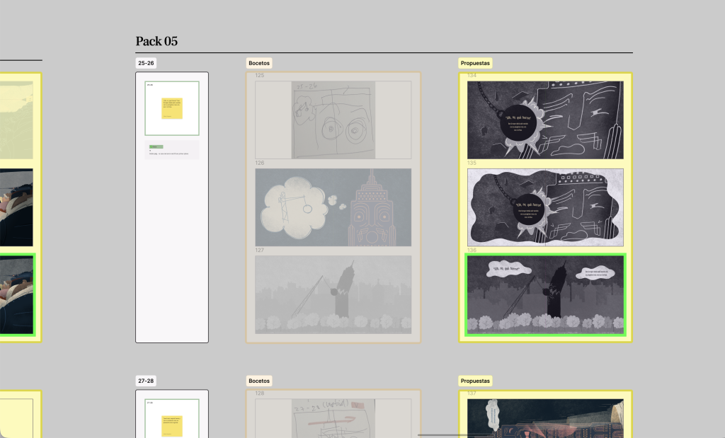
From there, the process settled into a clearer loop: 2–3 sketches per scene, the strongest pushed further for review, and 2–3 illustrations brought to each touchpoint with the author. Some scenes took longer than others — anything that shifted register, like the first time people appear inside the building, needed a clear visual context change, which meant pushing the style a step further each time.
Process of development of illustrations
Refinement process
Almost done!
Once every spread was illustrated, I went back through the whole book for a final refinement pass. The style had naturally evolved and gotten more assured over the course of the project, so I revisited the earliest illustrations and brought them up to the same level as the later ones — making sure the finished book reads as one consistent world, not a timeline of me figuring it out.
Handing it off
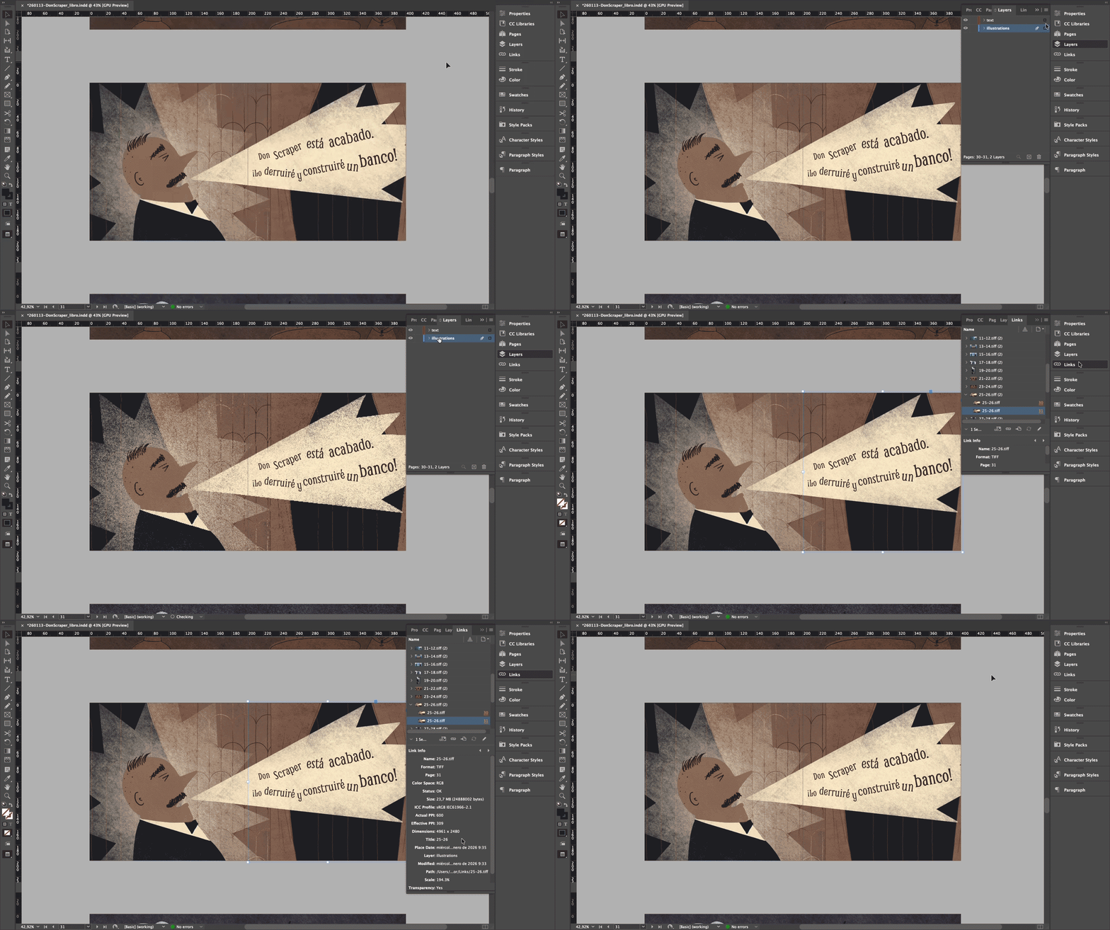
InDesign file ready for the printers hands.
Ready for the next hands
By the end, every spread was illustrated and refined, cover and endpapers included. What I handed over wasn’t just artwork: each double-page spread as its own PSD, a full InDesign layout of the book with text styles and illustrations linked, and a high-resolution PDF ready for whatever imposition the eventual production run needs.
Printing and production are the next step, and out of my hands from here, but the file structure means whoever picks it up has everything they need without guessing.
In closing
What this taught me
The author knows Don Scraper better than anyone — every major decision, from reading the story to picking the final style, was built with her, not delivered to her.
Running the project through a shared Figma file — organized by phase, with feedback attached directly to the work — kept a clear, documented record of what was asked for and agreed on, for both of us.
Every formal choice had to earn its place: the two reading directions and the way dialogue is set both grew out of the same idea — that a book about a skyscraper should let you feel his height, not just see it.
Partway through, I noticed the weekly rhythm was starting to flatten the book into repetitive scenes, so I built a storyboard to fix that before it became a real problem.
Handing off meant production-ready files — PSD per spread, a linked InDesign layout, high-res PDFs per page — not loose art someone else has to make sense of.
It was a special project to work on — one that let me prove to myself I could do it, and that my growth so far, personal and professional, was enough to lead, create, and adjust along the way to a consistent, well-designed book. drawing self-acceptance, it turns out, looks a lot like drawing a skyscraper.