I helped solve issues around scalability, performance and flexibility by designing the illustration style and illustration system for one of France’s most user friendly digital banks, BforBank.
A challenge arose
Context
BforBank decided to make a change, and aspired to become one of France’s most user friendly digital banks. With the brands re-design, they hired an artist to create the illustrations for their new identity, but they presented a series of issues that had to be solved:
BforBank didn’t own the illustration style, as they were created by an artist.
They didn’t work within a system because resources like colors, characters, sizing, etc didn’t have a clear building structure, they lacked consistency.
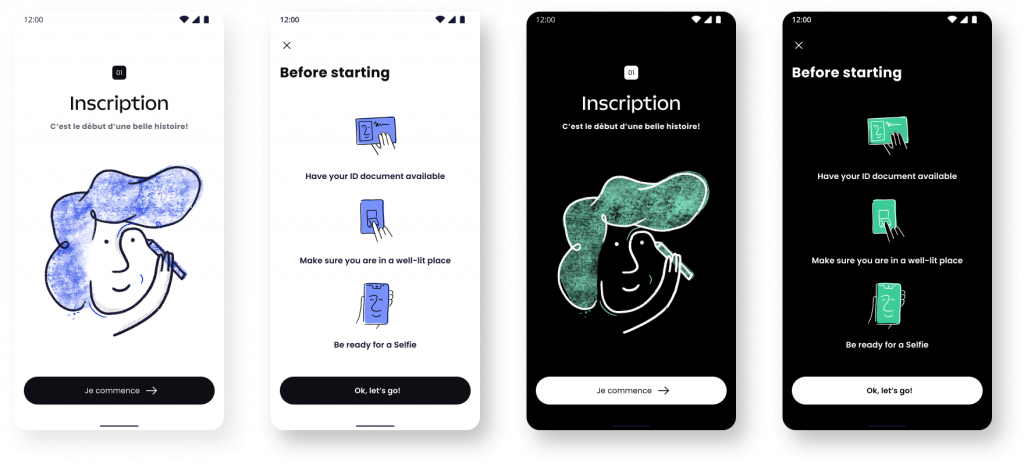
They weren’t designed to work in Light and Dark mode, therefore they lacked flexibility, which would worsen the user experience.
The illustrator delivered PSD files, which creates a technical issue, as the images would lose quality when scaled up or down.
They’d impact performance and user experience negatively sense this type of file tend to be quite large, amongst other issues.
The challenge
I was presented with the challenge of creating an illustration system that resolved all the issues previously described plus including in the scope the animation of some of them.
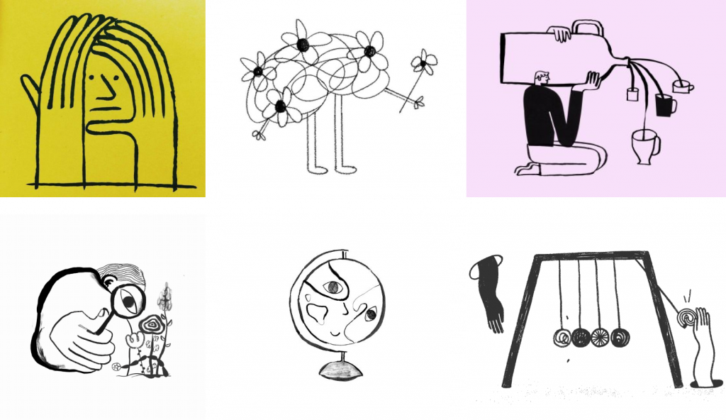
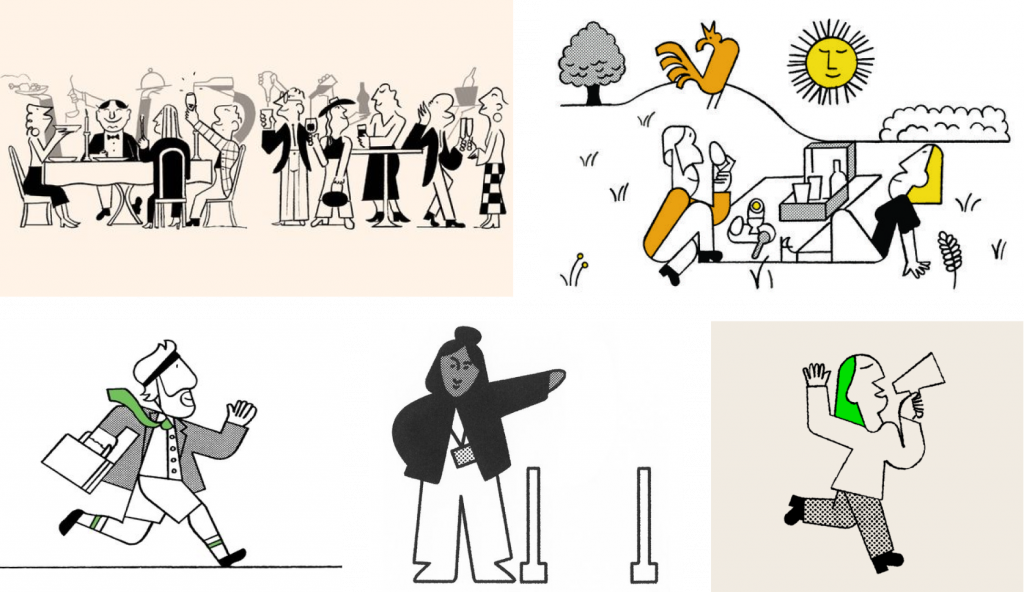
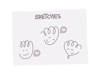
BforBank's old illustration style
A brand new begining
I worked hand in hand with the UI Lead/Brand keeper, Mario Merino. He introduced me to the brands principles, its visual resources and gave me a couple references for inspiration. And as a side note to take into account the attribute “delightful” as everyone was counting on the illustrations to bring this delightfulness to the apps visuals.
With that basis I made a selection of references I thought would fit in best with the brands principles and tone of voice. I then designed two style proposals, by defining: strokestyle, use of color for light and dark mode, textures, storytelling, taking into account different types of illustrations, like spot, microillustrations and larger illustrations.
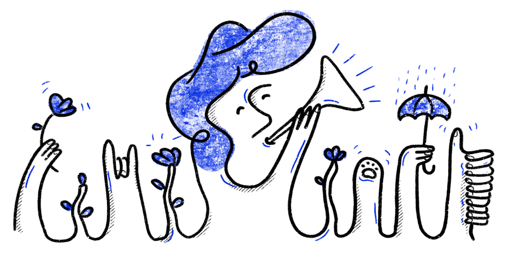
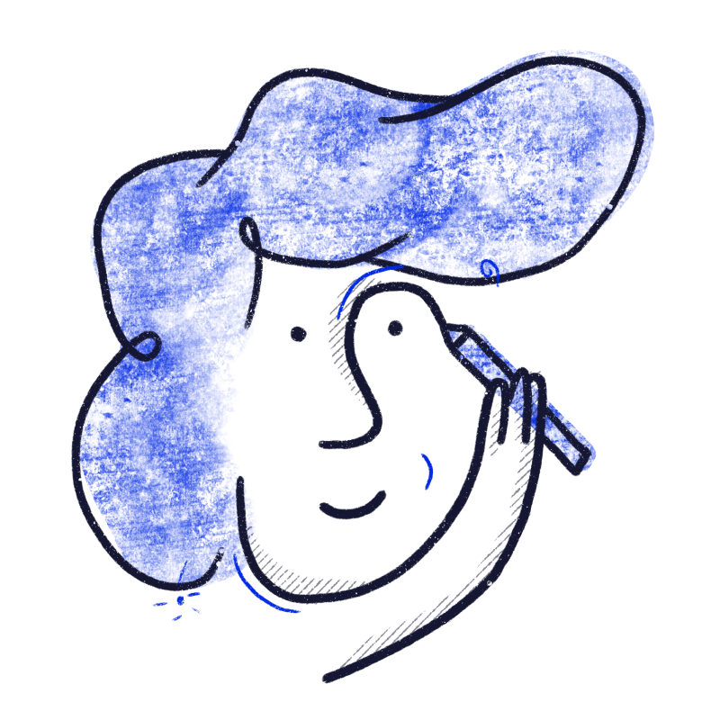
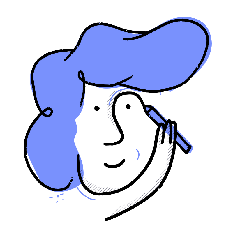
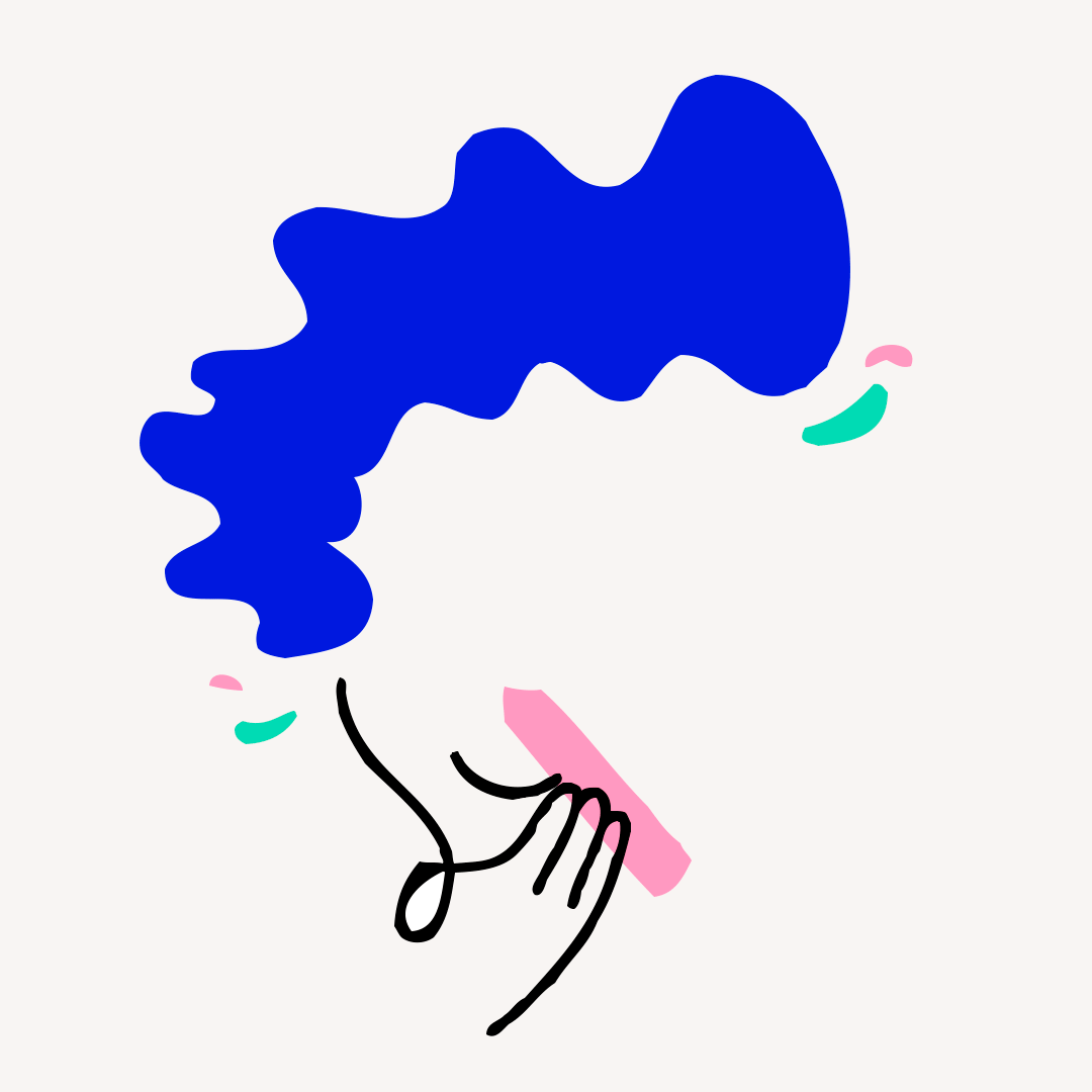
Style A – light, sweet and delightful
References for style A
Style A, proposal
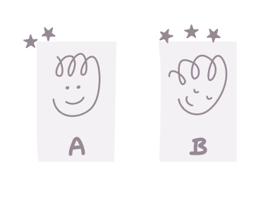
Spot type sketches
Larger type of illustration
Spot and microillustrations for Light and Dark mode
Pros • Continuous line • Few colors • Simpler, fewer elements
Cons • Bitmap for texture, not all vector • Concept construction
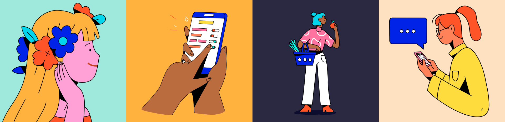
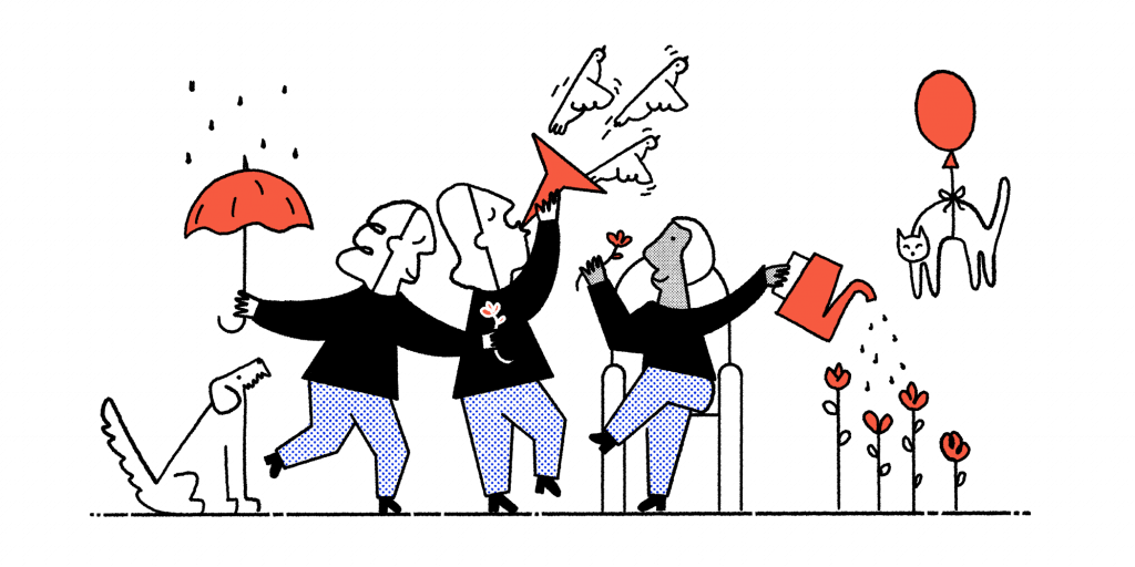
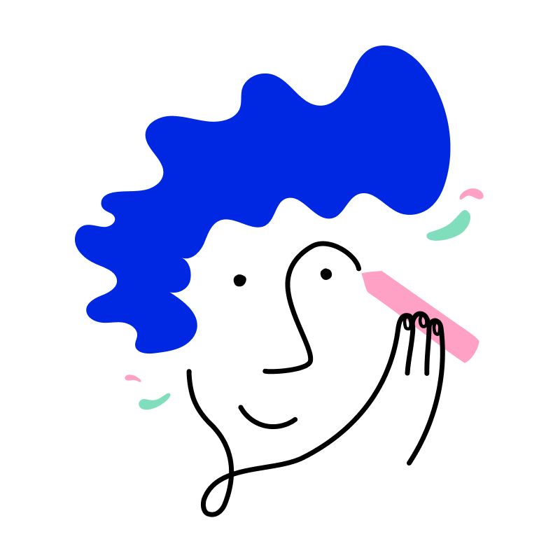
Style B – bold, playful and, also delightful
References for Style B
Style B, proposal
Larger type of illustration
Spot type sketches
Spot and microillustration for Light ands Dark mode
Pros •Continuous line •2 colors minimum •Easier to build concept
Cons •Still working on colors •Several elements, more complex •Bitmap texture, not all vector •Line texure animation in After Effects
Refining the style
Style A, was unanimously selected by the team due to pros and cons, but also for its delightfulness.
Challenges and restrictions arose
Then, taking into account technical restraints, changes had to be made in order to optimize their performance, specially as animated illustrations. We did many tests and research to find different resources that helped in creating viable animations with the effects we wanted, but they were still too heavy.
As a best practice it’s recommended that they weight less than 100-200KB. So, we had to lose the textured fill; then the textured vector line because it would make the animation process too long and difficult; then the boil line effect had to go too since it made everything too heavy. And with all of that cutting we ended up with our final style.
Style iteration
Bitmap textured fill, made the animation too heavy and not scalable.
A vector textured line was an issue for animation.
An all vector illustration has the best performance.
Animation test
Test with masks, lottie viable but 500KB
Test with effects, lottie non-viable and 500KB
Test with no effects - 30KB
Getting my hands dirty
Let the creation begin
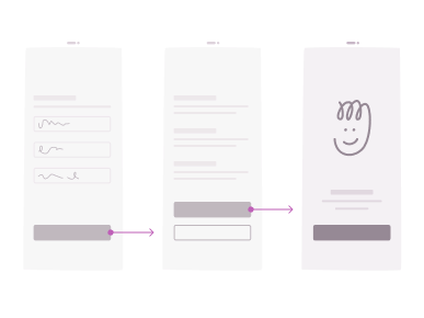
The team had already a working requests process, so with that, I created my own framework by organizing every request by squad (the team was organized by squad, every squad worked on a different feature of the app). It consisted of a system in which every request had three different boards: requests, references, sketches and finalillustration. I used status tags to have a clear view of what was in progress, in review, done, etc. on a zoomed out view.
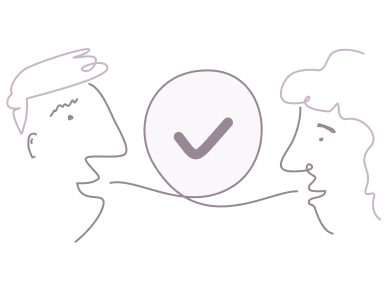
The way I asked for feedback was via Figma comments, tagging the correct people for feedback or final validation. If the need arose, we’d make a call for larger feedback.
My creative process
01.
I’d start by understanding the context of the illustration, meaning the flow the user followed to get to the illustration screen, so to have a clear understanding of their mood, tone, etc.
02.
Then I would make sure I had a clear understanding of the message that had to be communicated, by validating what I understood with the designer that requested it.
03.
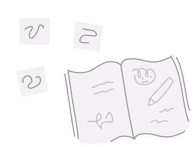
Next I’d reflect and write down ideas and look for references that could help communicate those ideas.
04.
And then I’d get to sketching, on paper, procreate or directly in Figma and when I would come up with 2 to 3 proposals, I’d pop them in the sketches board and tag the correct people for feedback and validation, which in this case were UI Lead, Tone of Voice keeper and Head of Design.
05.
With set comments I’d work on iterating the sketches for further feedback or final validation. In case consent wasn’t reached, we’d leave it to the rest of the team (anyone outside the design team), by conducting a simple and old fashioned A/B testing. It was one of the several UXR initiatives in looking to shorten the gap between the design team and the rest of the organization.
06.
Then I’d create the final validated design with the correct variables and tag the DS owner, so he’d create the component in the Figma library and upload it to Zeroheight (which is where the DS is documented).
Gettin’ jiggy wit it
Bringing everything to life
First we had to define an animation style, making sure the animations were part of the system, e.g. were easily reproducible. It was a fun process were I worked on an exploration that helped me define which elements were to be animated, the hair, the stains, the eyes, arms, etc; and how they were supposed to move, more or less details, more or less bouncy, etc.
Animation tests to define the animation style
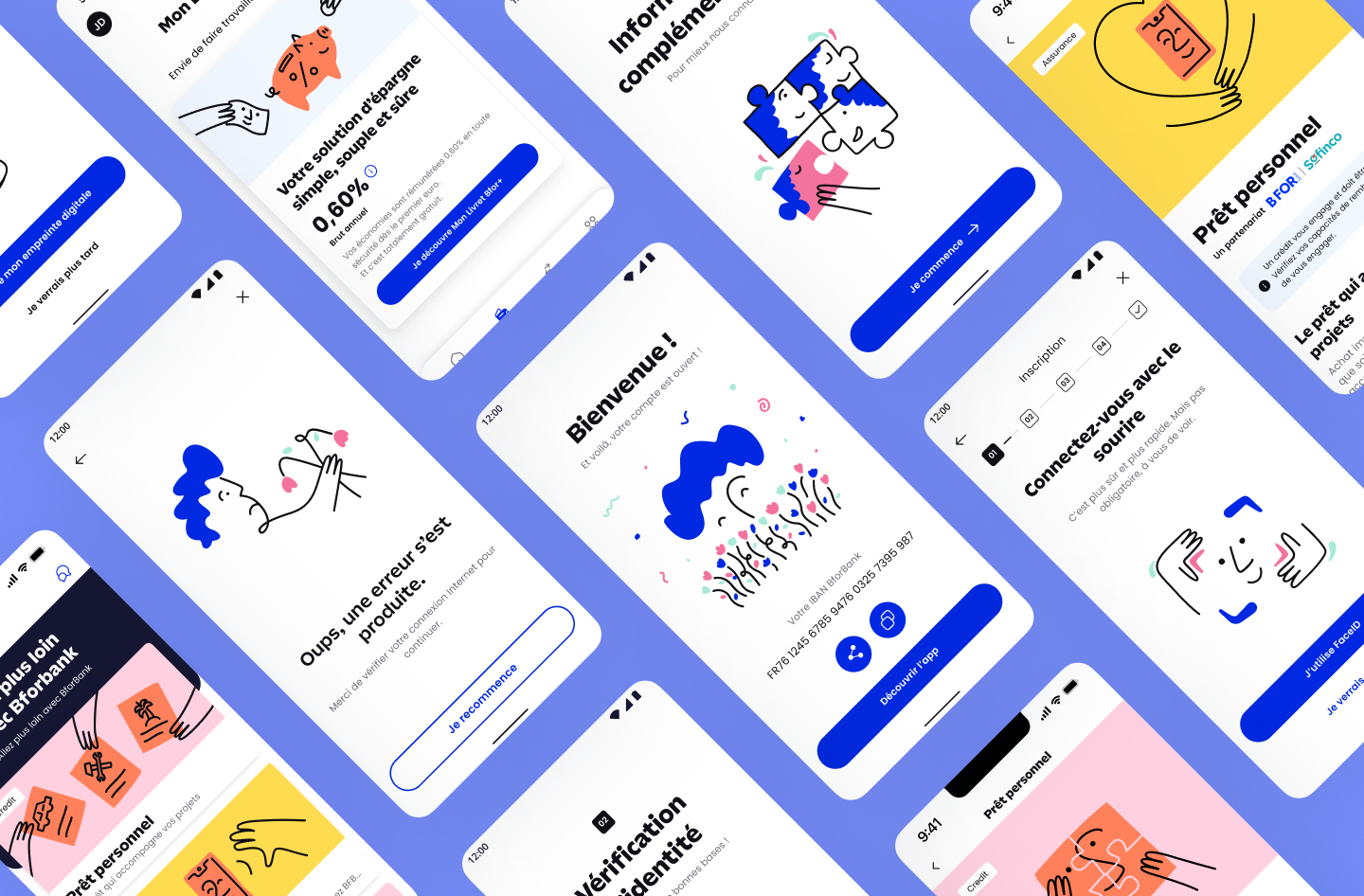
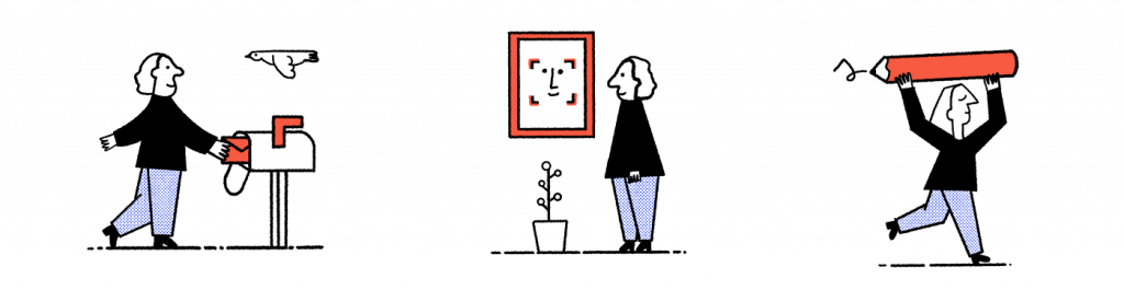
Covers used in the onboarding flow.
Animated illustration for the screen when the user finishes creating their account.
Animated illustrations for success and error screens.
A style variation was designed for financial products, here we can see animated illustrations for «mobile insurance», «loans» and «savings account».
In closing
A delightful experience
Working in BforBank as the illustration designer for the banks app, was one of the best professional experiences I’ve had so far:
I got the chance to work as a full time UI illustrator, which was high on my wishlist for a while, because I love the challenge of communicating a message visually.
I was given the space to implement my own framework in creating the illustrations. I established a way of working that was flexible enough to fit with the team and end up with a great result.
I managed to receive organized feedback with the framework I established (and of course most of it was constructive which was a delight), which was key in developing all the illustrations with minimum friction.
It was, mostly, a remoteway of working, which was a big plus for me, with in person touchpoints every 6 weeks and with having a multidisciplinary (designers, developers, UX researchers, etc.) and diverseteam, with people from all over the world, Colombia, Spain, France, Turkey, Italy, England, etc., those trips had a great balance of productivity, enjoyment and growth. For example, I took advantage of those trips to do the A/B tests with people around the office.
It was one of the best working experiences I’ve had thanks to the balance in growing professionally and personally, also getting to know so many awesome people, and of course visiting Paris every 6 weeks, all expenses paid, was a nice plus, couldn’t have asked for more ;).


