Brand Identity | Product System | Illustration System
astrorelatos
How the brand and product system behind an astrology-based storytelling platform took shape. From concept through the live site and printed book.
The challenge, more than a logo
AstroRelatos is a platform that turns a person’s natal chart into a personalized literary story, instead of a technical reading. My challenge was to design its brand identity.
From the beginning, educating the client became part of the challenge: the founder had never worked on a brand identity, so I had to explain what one is and why it’s more than a logo. That’s why I proposed the project in modules, adapting my services to what he needed. In the end he took two, identity and editorial, and a third service took shape along the way: illustration system design for the brand’s AI-generated images.
Seeing eye to eye
To define the concept I needed two things: understand what the client had in mind, to stay aligned with him, and understand the product itself, the story. For the first, I set up a shared FigJam and asked him to fill it with references across every dimension and to explain his reasoning behind each one, then confirmed my understanding back to him with a short deck. For the second, I read my own personalized astrorelato. As a skeptic of astrology, I was struck by how much I recognized myself in a story written by someone who’d never met me, and that experience shaped the concept.
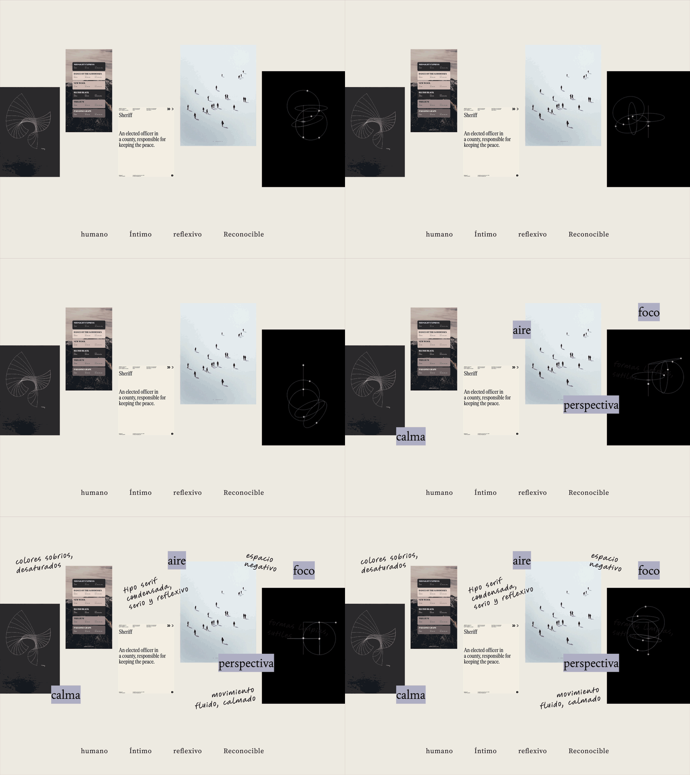
That led me to two directions, “Leerte” (read yourself) and “Otra mirada” (another way to look at yourself), and the client chose the second. His feedback sharpened it: he put the human at the center and gave me two key words, reconocer and redescubrir. We refined the concept together, so the base was built by both of us, not just me. Its core: not telling people who they are, but offering a different angle on who they’ve always been. Its attributes: reflexivo, humano, íntimo and reconocible.
Giving the idea a face
Before looking at references I set five design principles (color, typography, composition, imaginario and motion) to organize my ideas and guide the search. With them I proposed two visual directions as moodboards, to validate the visual base with the client and its alignment with the concept. He chose Camino 02: clean line-based forms that reveal movement as the viewpoint shifts, with a sober, desaturated palette and a reflective, precise feel.
What the brand is made of
Typography
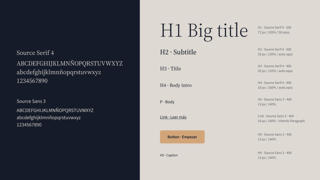
It started with a concrete question: how to stay consistent between digital and print. I set aside the rule «serif for paper, sans for screen», since recent research finds no real legibility difference, and judged each family on x-height, spacing and behavior at small sizes. Source Serif 4, paired with Source Sans 3 for UI, isn’t the condensed look the moodboard suggested, but it won on the full set of criteria: sober and delicate, with ball terminals that give it a hand-drawn air, and one coherent pair for headlines, long reading and UI across web, ePub and print. It’s a conscious departure, since the combined criteria weighed more than a literal match.
Logotype and isotype
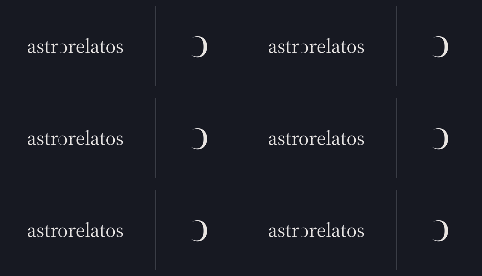
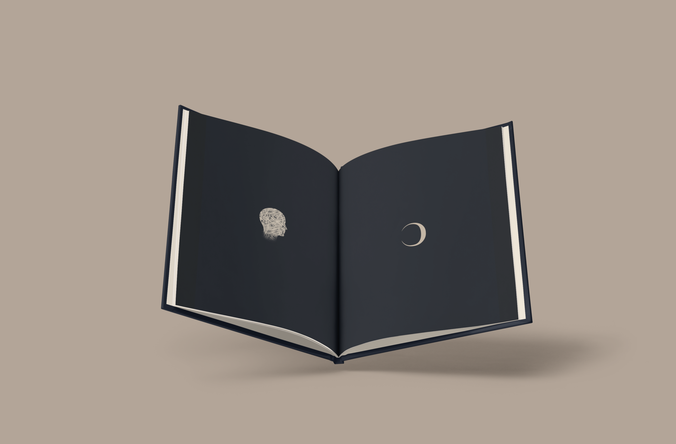
I explored two variants, separated by one axis: transforming the «o» from within, revealing what the letter already contains, or adding astral elements from outside (comets, constellations, orbits). Only the first was defensible under the concept, so I presented it as the main recommendation and kept the others as evidence of process. The client needed a nod to astrology even though the brief ruled out anything esoteric or stereotypical, and the transformed «o» resolves it: it fuses the typographic and the astrological in one gesture, comes with an animation, and works isolated inside a circle as the isotype for favicon and avatar. He approved it.
Color
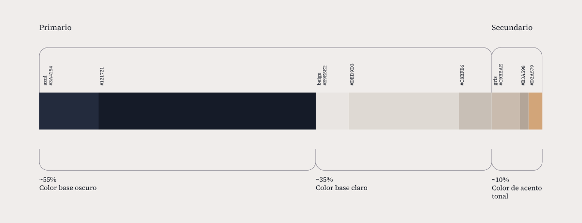
A dark, blue-based palette (Azul noche, #151B28) with a warm light base (Beige cálido, #E9E5E2) and a tonal taupe accent. No saturated colors: contrast comes from tonal value, not hue.
Imagery
The identity was meant to specify how the images should be, not to produce them, but I ended up designing an illustration style, two brand images and reusable assets, which grew into a generative system. That work is illustration system design as a service in itself, and the subject of its own case.
Trying it on for size
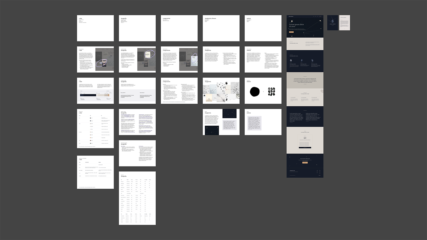
Foundations kit delivered to the developer for implementation
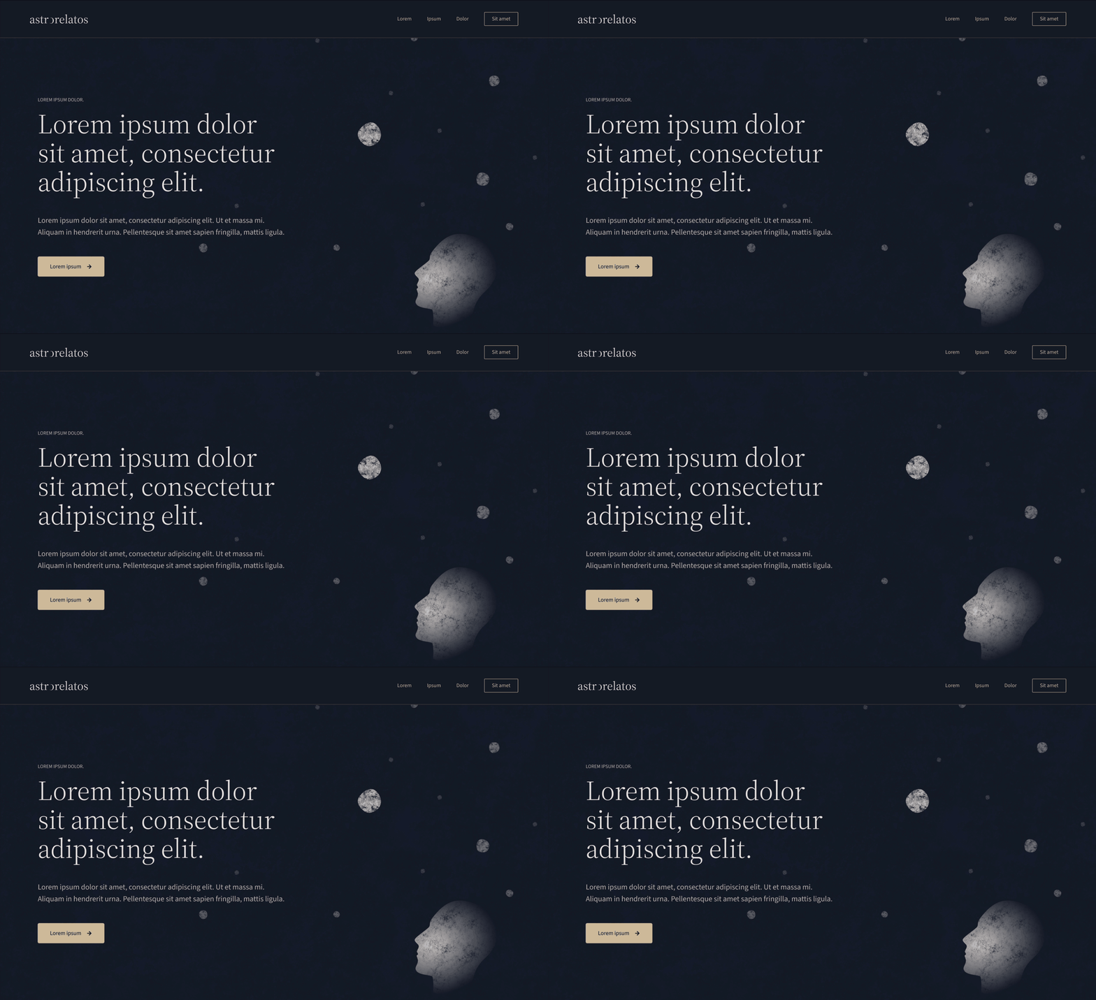
I wasn’t hired to design the website, but to design an identity that works on the web. To check that it did before anyone built anything, I used the moodboard the client chose to prompt Figma’s AI for a wireframe of the landing page in that style, and on it I adjusted the palette to make sure it was functional and tested the typefaces and their text styles. I then showed him the identity applied to that screen, so he could see how the separate design decisions worked together. His feedback led to an iteration on the accent color, but it didn’t land. Instead of trying more variations, I proposed a call: there I understood his point of view, explained my reasoning, and we built the iteration together to close the phase. With that validated, I built the foundations kit, which the developer used to generate the site. Once it was built, I gave visual feedback to refine it and make sure the identity was applied correctly, and I stayed flexible: where I saw that something I’d proposed in the kit could be better, I adjusted it.
Turning the page
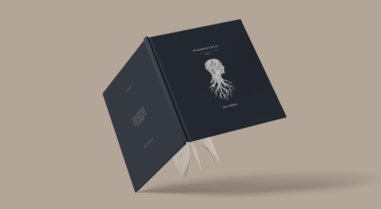
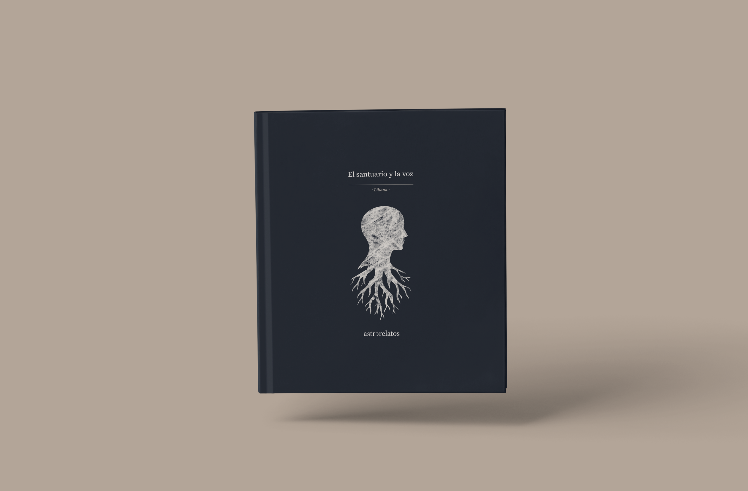
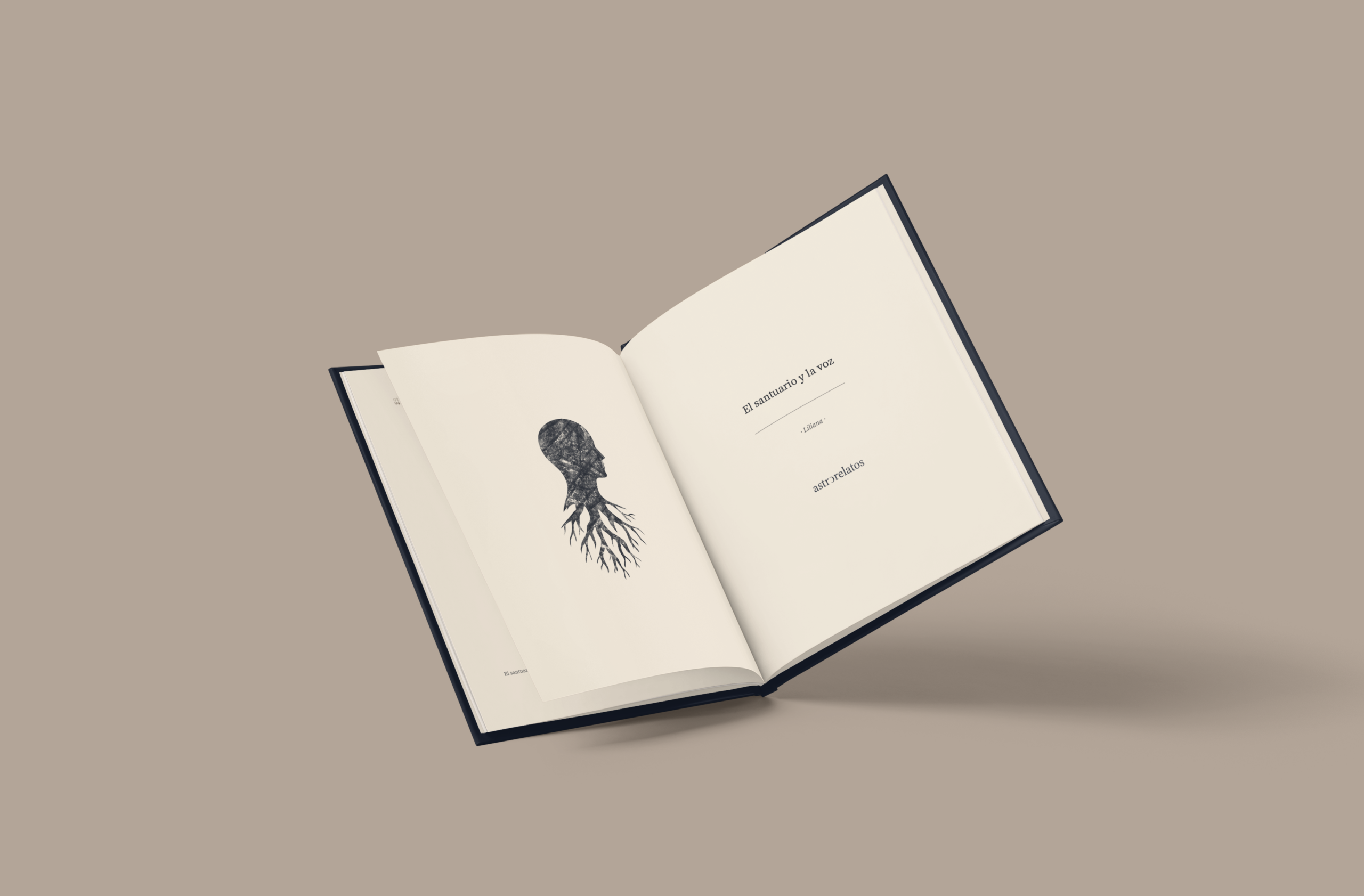
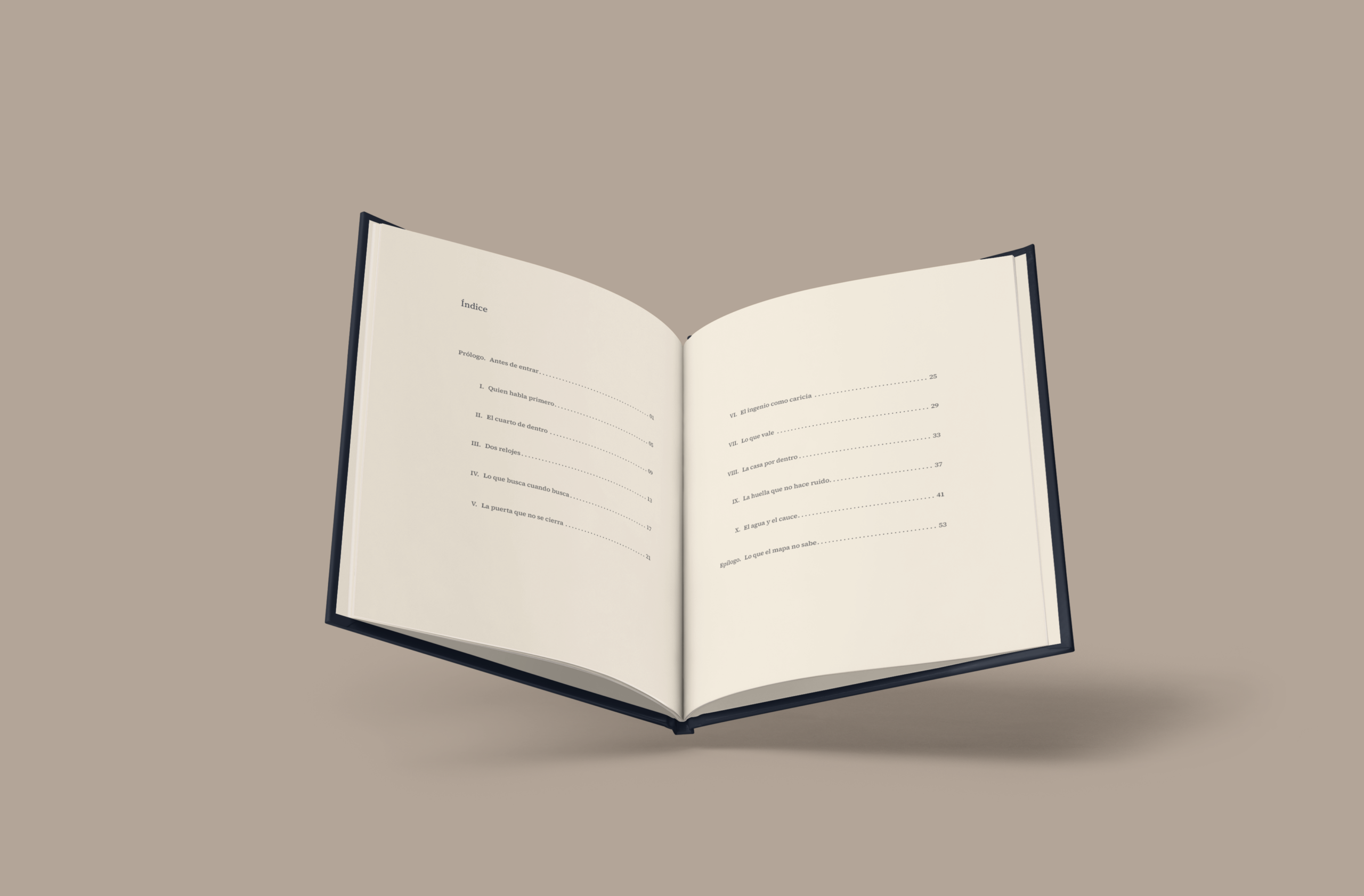
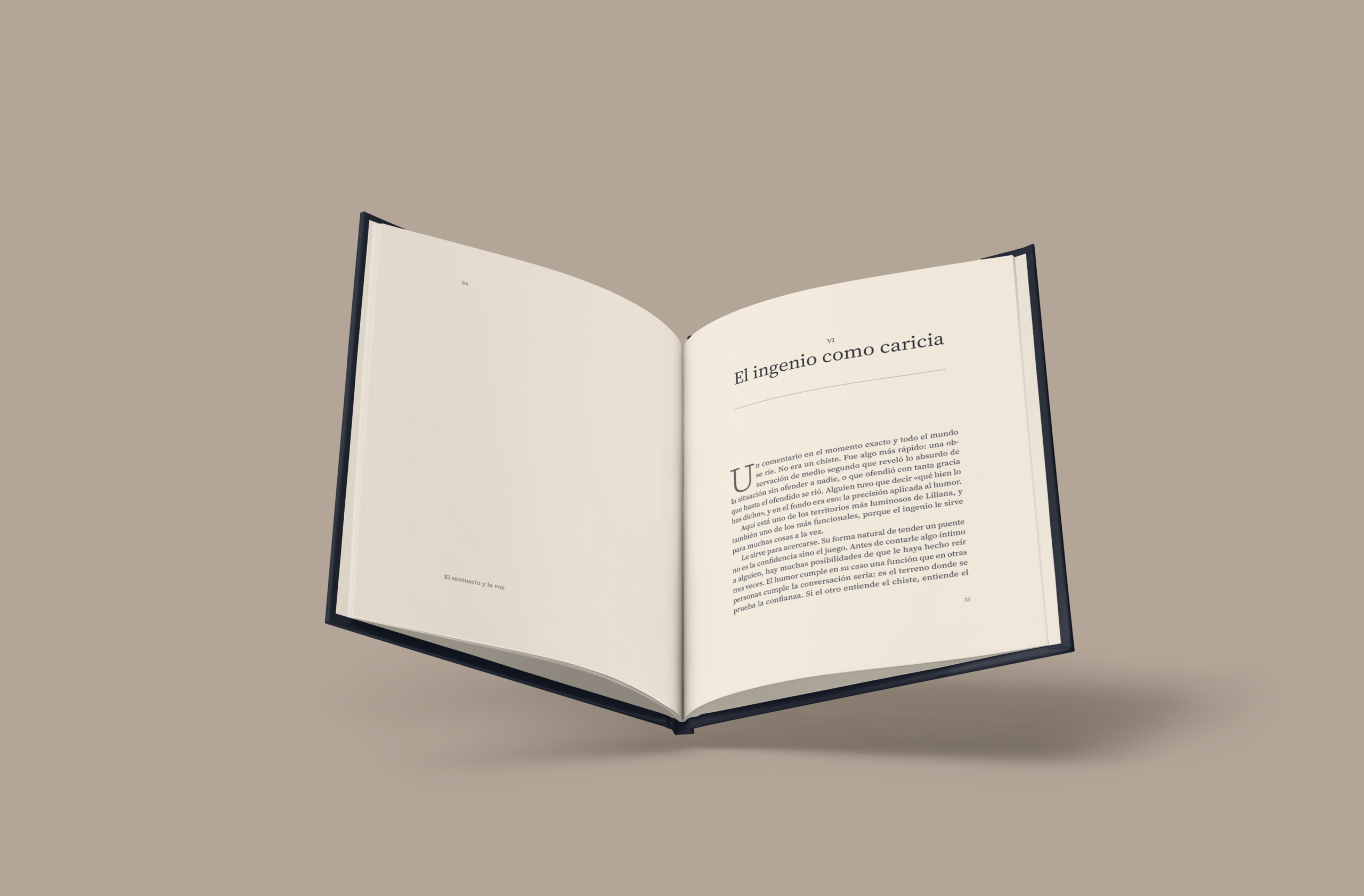
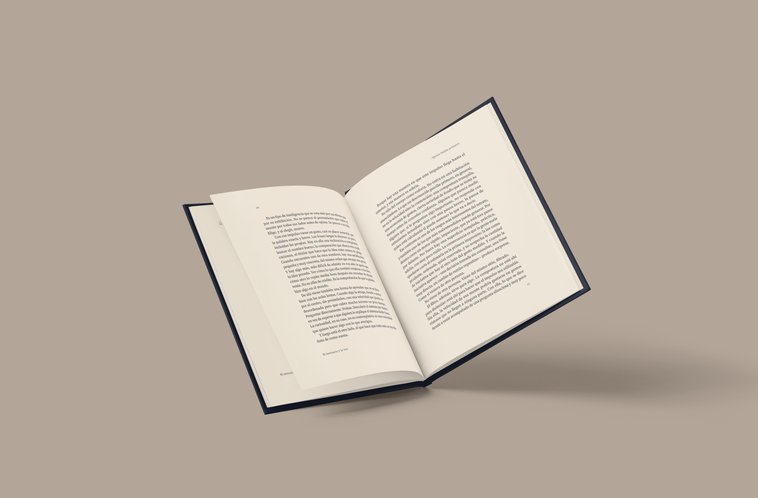
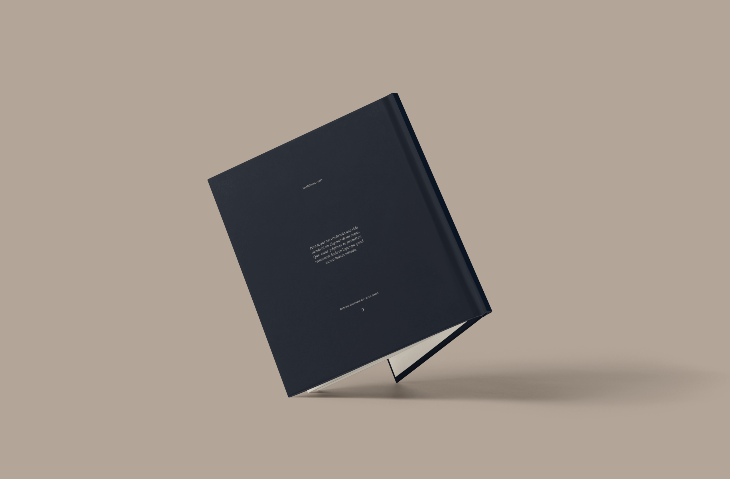
This was one of the modules I’d budgeted from the start that the client hadn’t identified as a need. Once he understood it, he saw the importance of designing it in detail. It took the identity to a physical product: a printed book generated for each person. Since no two books are alike, I designed a layout system, not a closed piece, starting from a real generated story, not sample text.
A classical base, on purpose
The «reconocible» attribute asks for the book to read as solid literature, not as a quick consumer product, so I built it on the classical book tradition: symmetry, order and a sober hierarchy that convey trust before a word is read. The brand enters without adding ornament, for example in a separator made of a plain line with the isotype mirrored on each side.
Personalization
On that stable base I added the variation, following «otra mirada»: reveal what’s already there instead of adding something from outside. On the page that matches the protagonist’s birth day or month, the folio mirrors outward and changes color, an almost invisible nod that leaves the person’s mark in the pagination itself.
Documented to be reproduced
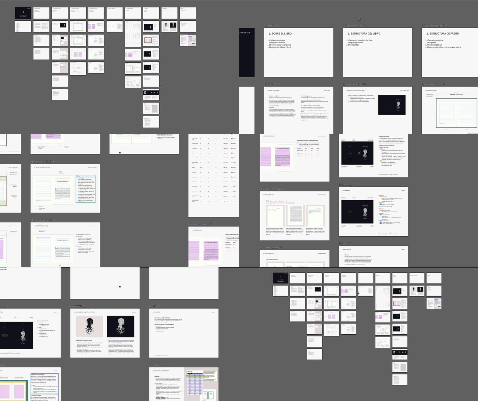
The system only counts if another person can build it, so I wrote it up as a design manual meant to be reproduced in code, where every element lives complete in a single place.
In closing
Looking back
Don’t assume the client knows what they’re asking for. Someone can request an identity design without knowing what it involves, and the same words don’t always mean the same thing to both of us. So it pays to clarify terms from step zero, even the most obvious ones and even while building the budget. That’s what makes alignment more efficient and the result meet the client’s expectations.
When we’re not understanding each other, change the approach. If an iteration doesn’t land, recognize the misunderstanding and approach it differently instead of trying more variations. A call let me understand his point of view and explain mine, and the iteration was built together.
Involve the client at every step. Asking for feedback and applying it lets clients see their own point of view in the final result, so they feel part of it instead of disconnected from it. That’s what happened here, at every milestone that shaped the brand’s future.
Keep a record of what’s been validated. I kept a Figma page with only the approved steps, so that if a change request came up outside the process, I had a clear reference to take the conversation to.
Imagery that has to work on its own is system design, so scope it separately. An identity can specify how images should look. Once they have to be generated without anyone curating them, you’re building a system. The signal is when I start iterating with real generations, fixing exact technical values or producing final files, and that’s the moment to reopen the scope instead of absorbing it into the identity.
A system isn’t finished at handoff. Seeing the kit applied in the built site showed me things I’d proposed that could be better, and adjusting them was part of the job.